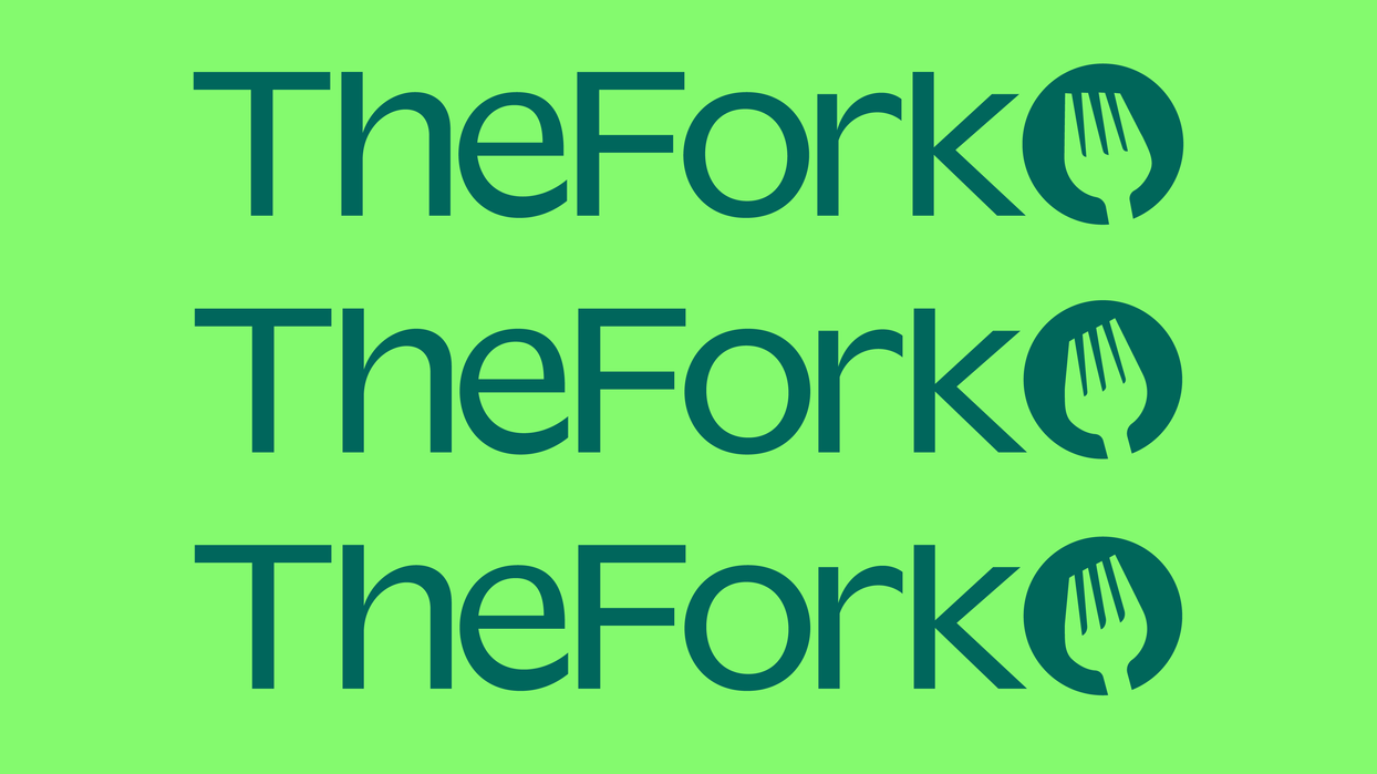


At the centre of TheFork's ideology is the concept, 'The best things in life happen around the table.' We decided to capture this through a strategic brand platform that brings people together in a world that is increasingly digitized, campions restaurant culture and feeds, not only people, but the also human spirit as well.
Built around the creative idea, 'Feed your Spirit', our entire identity system is based on the energy of people coming together around a table and energy radiating outwards.
TheFork symbol sits at the heart of the identity, inspiring the full system from type and graphic patterns to illustrations crafted by Tubik.
The symbol is also full of personality capturing the raw energy of the human spirit. The curves of the symbol are complimented by Valizas by Luzi Type, a characterful sans serif font.
Final Outcomes
Created by the DesignStudio team
After a period of rapid growth and extension into new offerings and new markets, TheFork needed to reestablish their leading presence and better define and express the brand in order to build awareness and relevancy with their three audiences: diners, restauranteurs and employees.
TheFork team decided to partner with DesignStudio for a brand overhaul.
As a design resident/ intern working as part of larger team of designers and strategists, I was given the opportunity to contribute towards various aspects of the project including the logo and word mark development, colour story, type, art direction style, illustration and development of the graphic language and overall visual identity.
Shown below is a small portion of my personal experimentation and process for the project.


